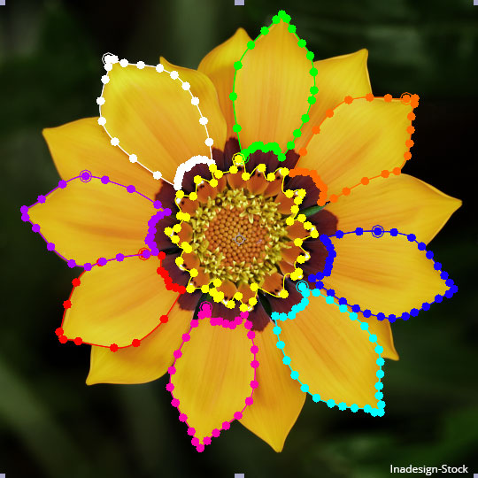
Choosing the right mask colors in Adobe After Effects is really important if you do lots of rotoscoping, or stroking paths, or anything involving a lot of mask work. A mask whose vertices and handles get lost among the complexity of an image causes mis-clicks which is a huge time waster. And masks that are all the same or of similar colors make it hard to select the right one, especially if you’re selecting it in the timeline where a mask is divorced from its shape.
But what colors are best? Here are some handy guidelines:
- The name of the game is contrast with the original image, as well as contrast from each other. Therefore, choose all fully saturated colors, which stand out more and look less “natural” which means they’ll tend not to show up in photos and video footage to compete with your mask. Also, the more you desaturate colors the more they tend to look like each other.
- Brighter is generally better. That’s because darker colors also tend to look like each other. In addition, masks which are keyframed are 25% darker when not on a keyframe, so you can tell, without even looking at your timeline, whether you’re on a keyframe or not. If you’re like me and you want to keep your keyframes to the minimum possible, this can be handy indeed. But it’s only really useful when using bright colors as its tougher to tell the difference the darker you get. And with a black mask, there would be zero difference in appearance between a keyframed and non-keyframed mask.
- Give a wide berth between colors, for two reasons. First, because of the relativity of colors, a mask set against your image in the composition window may look different when set against the gray of the timeline window. Second, the color may actually be different depending on if it’s keyframed or not (see above). Purple and fuchsia (hot pink) may look different enough side-by-side, but compare the un-keyframed fuchsia to purple and it gets a lot tougher to tell them apart.
In order of most to least preferred colors, here’s what I use:
[one_sixth]![]() [/one_sixth]
[/one_sixth]
[five_sixth_last]1. Red. Likely to work with almost anything, even light or dark images.[/five_sixth_last]
[one_sixth]![]() [/one_sixth]
[/one_sixth]
[five_sixth_last]2. Green. Also works with light or dark images but not good for green screen footage.[/five_sixth_last]
[one_sixth]![]() [/one_sixth][five_sixth_last]3. Blue and Yellow. Blue works great with a light image and yellow works great with a dark one.[/five_sixth_last]
[/one_sixth][five_sixth_last]3. Blue and Yellow. Blue works great with a light image and yellow works great with a dark one.[/five_sixth_last]
[one_sixth]![]() [/one_sixth][five_sixth_last]4. Aqua. Works well enough with light images and great with dark ones, just make sure its hue is far enough away from green and blue.[/five_sixth_last]
[/one_sixth][five_sixth_last]4. Aqua. Works well enough with light images and great with dark ones, just make sure its hue is far enough away from green and blue.[/five_sixth_last]
[one_sixth]![]() [/one_sixth][five_sixth_last]5. Orange. Works great with light and dark images, but don’t have it too close to red or yellow.[/five_sixth_last]
[/one_sixth][five_sixth_last]5. Orange. Works great with light and dark images, but don’t have it too close to red or yellow.[/five_sixth_last]
[one_sixth]![]() [/one_sixth][five_sixth_last]6. Fuchsia. Nice and bright, just make sure it’s not too close to red.[/five_sixth_last]
[/one_sixth][five_sixth_last]6. Fuchsia. Nice and bright, just make sure it’s not too close to red.[/five_sixth_last]
[one_sixth]![]() [/one_sixth][five_sixth_last]7. Purple. Good because it doesn’t occur in real world footage very often (some say not at all). But it can be tough to differentiate from blue or an unkeyframed fuchsia.[/five_sixth_last]
[/one_sixth][five_sixth_last]7. Purple. Good because it doesn’t occur in real world footage very often (some say not at all). But it can be tough to differentiate from blue or an unkeyframed fuchsia.[/five_sixth_last]
[one_sixth]![]() [/one_sixth][five_sixth_last]8. White. Only works for dark images.[/five_sixth_last]
[/one_sixth][five_sixth_last]8. White. Only works for dark images.[/five_sixth_last]
That’s it. After tossing out the colors not appropriate for a particular shot/image (green for green screen, bright colors for bright images, etc.) I pretty much cycle through the remaining colors of the group above. By the way, if you don’t want to choose these colors manually in After Effects, use this page instead! Here’s how you do it:
- Have this page side-by-side with After Effects so you can see both at the same time.
- Click on the color chip of the mask whose color you want to change to bring up the Color Picker.
- Click on the eyedropper, then click and drag over to the color chip on my page, only releasing when over the color. Note: the drag is important, clicking on the eyedropper, then clicking on the color on my page only took me to the web browser with my web page, the color never got transferred to AE. The drag must start over a window in AE, then drag to the color you want. This was done on a Mac running Lion using AE’s color picker, you don’t have to do the drag with the Mac OS system color picker but I don’t know if it’s any different on other OSs.
Special Bonus: What Color Do I Like for the Background?
Well, it’s definitely not black generally (the default), because many images have black strokes which makes it tough to tell where the image ends and the background begins. So I use:
[one_sixth]![]() [/one_sixth][five_sixth_last]Magenta. Not often found in shot footage which is what I’m going for. The only downside is if you’re doing color correction/grading,the blast of color may affect your tender color grading eyes. In that case choose a non-black neutral color like dark gray.[/five_sixth_last]
[/one_sixth][five_sixth_last]Magenta. Not often found in shot footage which is what I’m going for. The only downside is if you’re doing color correction/grading,the blast of color may affect your tender color grading eyes. In that case choose a non-black neutral color like dark gray.[/five_sixth_last]
There’s no reason doing work in After Effects should be any tougher than it needs to be. Choosing the right mask colors for your shot or image will definitely help with that.

Good info. I agree with you and use a lot of the colors recommended here— especially about the contrast. A mask that contrasts enough with the background really helps you see if your matte is properly and tightly framing an object — if it’s a pixel or two off and your mask color blends in or is too light, your eye might not notice while you’re working. Thanks Tony!