Most of the time my workaday world is all virtual. Create something on the computer, make a video and post it to Vimeo, or make a digital file that an editor cuts into an edit, which I might then see on TV some day. Nothing physical that I could hold in my hand. But lately I’ve been getting into something different: the analog world, the world of the tactile, the world of business cards.
I recently designed the business cards for my wife’s talent management company, CBM. This took a little adjusting. For video I’m thinking about action and title safe, color space, and frame rates, data rates and codecs, but in the print world I had to familiarize myself with letterpress, bleed, flood, die cuts, blind emboss, knock out and press checks.
This week I’m going to talk about the process of translating CBM’s logo and brand into something physical. Next week I’ll go over the experience of working with our printer, Aardvark Letterpress in Los Angeles.
Creating a good business card for my wife, Cheri’s, business meant taking a look at her brand and making a card that summoned those qualities. Don’t get the wrong idea when I mention branding, I’m just talking about her style, how best to get across the qualities of her company. Or read this. Anyway, to me having a brand is the touchstone, and you’re always coming back to whatever you create for a client to make sure it adheres to that touchstone. It’s easy to make something creative and fresh, but something creative and fresh that meets a client’s branding goals is a whole lot tougher.
As a new business trying to prove its viability in the marketplace we knew her brand had to be at least a little “business-y”; we wanted potential clients to take her seriously. But clients also see her as a warm and open-hearted person and that warmth had to be represented as well. Hitting both those marks makes it a tougher needle to thread. These were the design goals of the business card, which in execution broke down to process, paper, font, color and composition.
Cheri’s experience at previous companies in the entertainment industry convinced her that a business card of quality, whether through an interesting design, cool logo or quality materials, pays for itself. It helps people remember a company and what they remembered was positive. That’s why one of the earliest decisions was to go with letterpress (the process mentioned above), despite the increased cost. We knew something that was so tactile would be memorable and would say this was a professional outfit through and through.
Paper: same for the paper which is Savoy Natural Weight, 236# made by Reich, and boy is it thick. It definitely gives you something for the press to sink into. And I love that it’s not pure white, it tends toward ivory which makes it a very subtle complimentary color to the aqua of the logo and text, and is also suggestive of the off-white in her web site.
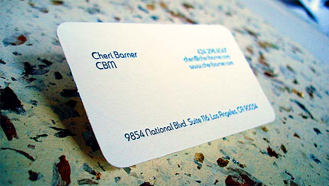
Font: for the choice of font I chose Madurai because it has the same curves of the logo with a cleanliness that feels right at home in a business environment. The rounded corners on the card, similarly, go well with the curves of the logo.
Color: of course color doesn’t work the same way in the print as in the video worlds. It’s not only going from RGB to CMYK but spot colors have no corollary in the video world. I knew my RGB value for the logo was going to have to translate into some kind of Pantone value but luckily PhotoShop helps you out with that. To convert your RGB value into a Pantone spot color:
- load up your RGB value into the foreground color chip.
- Click on the color chip to bring up the Color Picker, then choose Color Libraries.
PhotoShop will make its best attempt to convert your color to a color in your library of choice, and it did a pretty decent job in this case. It chose Pantone 7700 C, sort of a dark aqua, which when we got to the printer ending up being a tad too light, so we went with 7701 C.
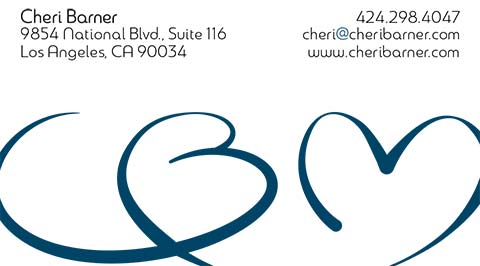
Composition: at first we tried to cram everything onto one side but it just didn’t look right. This particular logo needs to be big to look right and it was just crowding everything else out. So we decided to have the logo on the front and all the type on the back, which gave enough breathing space for both.
For some reason when I think of designs on the printed page I often have a bleed. About the best way I can explain it is when part of the design goes to the edge of the page I think the brain naturally tries to continue the design off the page, and having an unseen part of the design adds mystery. It somehow expands the design in a way I think is really cool, that’s why we made the logo bleed out on the left and right.
Overall it turned out to be a successful transitioning of the look of the logo and online presence to her business card, so for now it’s back to my day job. Goodbye press checks, hello codecs once again!