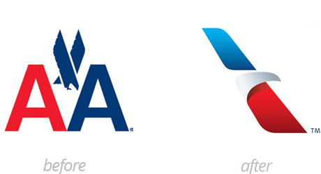
I don’t expect an eye-catching logo redesign to come from a corporate behemoth. Not that I necessarily blame them, a lot is at stake, and when trying to balance risk versus reward large companies often give more weight to the downside risk side of things. So I was pleasantly surprised when I saw the new logo for American Airlines recently. First start with the change in shade of blue, the navy with that red definitely felt old. But the most amazing part is the new mark suggests no less than four things:
- an uppercase A
- the beak of an eagle
- a star
- the tail fin of an airplane.
You could even argue there’s a runway in there but that almost feels like an accident. Anyway, kudos to Futurebrand for designing the new logo.
Thanks to the guys at Brand New for turning me on to this one.